A Vibrant Home: 93 Square Metres Bursting with Colour
An Apartment Revived Through Renovation and Vibrant Interior Design
The internal layout remains unchanged, but a completely bespoke interior design now dominates, where colour takes centre stage and reflects the residents’ personalities. Rich, vibrant tones inject warmth into every room, transforming furniture and walls into symbols of comfort and newfound vitality.
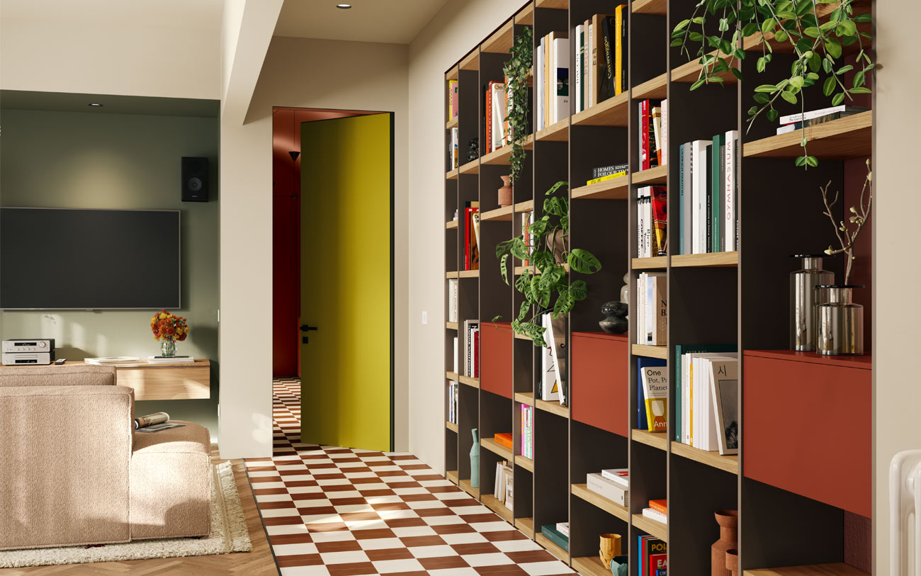
In this renovation, colour invades every room, beginning at the entrance, where a large bookcase showcases an array of art books and limited-edition publications focused on design, typography, and graphic arts. This area sets the tone for the overall design ethos: crafting a personalised home that resonates with the clients’ tastes while creating distinct functional zones.
Colour serves as an architectural element, enhancing spaces without adding unnecessary clutter. Each room features at least one standout colour, often more. In the living area, a wide range of colours fosters connectivity between spaces, seamlessly blending daily activities with the vibrant atmosphere.
The Colourful Living Room, A Colour Palette for Every Area
In the living area, two flooring areas in different shades and materials separate the entrance from the actual living area. On one side, geometrically arranged white and red marble tiles create an eye-catching focal point, harmonising with a bespoke bookcase featuring an Grigio cenere and Rovere chiaro frame, complemented by brick-coloured closed storage modules. Transitioning to the living room side, marked by parquet flooring, the ambiance shifts to a more subdued palette, emphasising a welcoming and cosy atmosphere.
This side of the room facing outwards also houses the kitchen, dining room, and living room, each defined by contrasting colours: Cachi for the kitchen and Oliva for the living room.
Despite the bold colour combinations, the two palettes coexist harmoniously, creating a dynamic yet cohesive environment.
The combinations are powerful, achieving the desired effect. The alternating use of bold colours and neutral tones ensures that colour remains a vibrant decorative feature without ever appearing overdone or fatigued.
The kitchen exudes liveliness and contemporary flair, while the living room evokes calmness, relaxation, and a modern aesthetic.

The kitchen and living room walls face each other and are arranged in two niches in their respective colours. The effect is striking and amplifies the depth of the room, enhancing its volume and three-dimensionality.
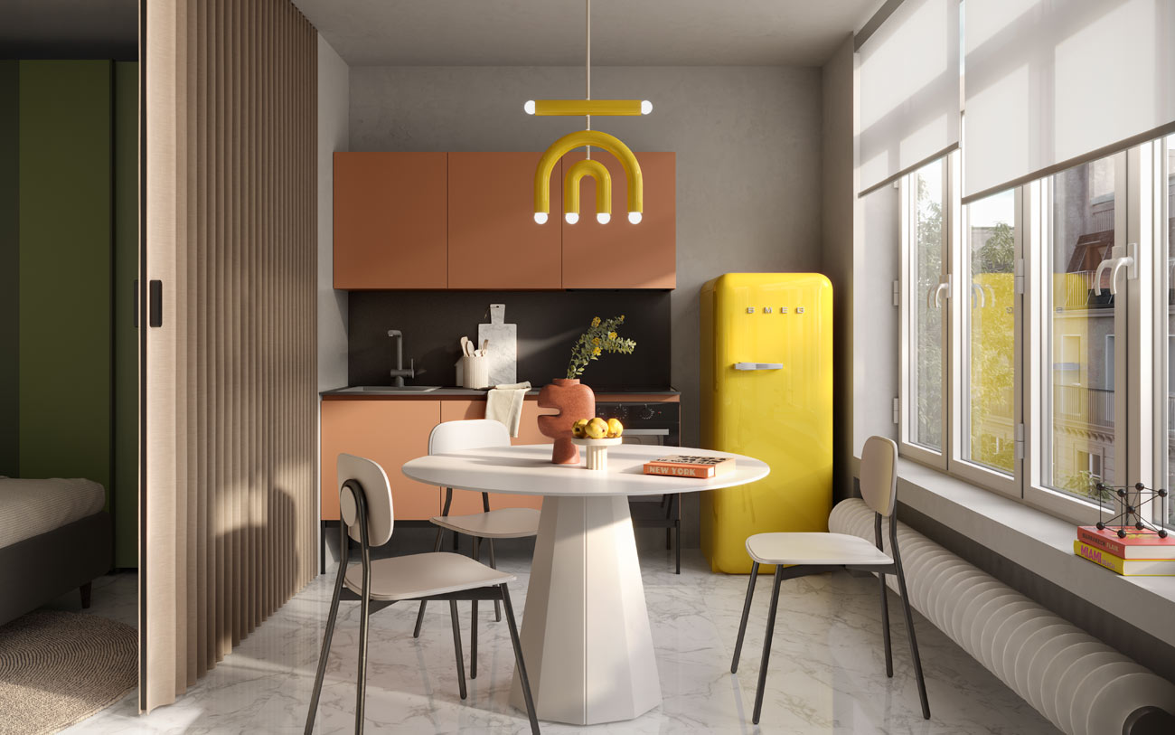
The Two-Tone Kitchen: Beauty Meets Functionality
In the kitchen, two colours take centre stage: Bianco opaco in PET and Cachi for the island. The former defines the columns, the latter customises the island. In this area, the columns boast clean-cut shapes and precise geometry. All are 60 cm wide and fitted with our PET framed doors. One houses the refrigerator, while the others serve as pantry space and storage for pots, dishes, and utensils.

Meanwhile, the worktop and appliances are situated on the island, where a Cachi lacquer complements a Laminam Noir Desir countertop featuring subtle orange veins.
The appliances are selected to blend seamlessly with the varying shades of the countertop, all sourced from the Franke brand. The exception to this choice is the kitchen hood: Elica’s Seashell not only provides suction, absorption, and filtering functions but also serves as a decorative element, resembling a chandelier.

The dining area is a real gem. Positioned between the island and sofa, serving as a link between the kitchen and relaxation area, is a 120cm round Planet table in pristine white. It is complemented by chairs featuring a Zafferano metal frame and upholstered seat and shell covered in fabric, all from Connubia.

The Tranquil Green Living Room
The olive green plaster, echoing the wall, takes centre stage in this part of the apartment. It embodies not just refinement and beauty, but also seeks to evoke a connection to relaxation and nature through colour. The Verde oliva wall unit incorporates open elements in wood that disrupt its solid form, creating a sense of movement. This design also provides an open space for storing frequently used items and books, aligning perfectly with this vision.

Additional furniture pieces complete the decor, featuring muted, complementary colours. The four suspended drawers and sofa also reflect natural tones associated with comfort, warmth, and tranquillity. The Rovere nordico finish, with its decorative grain, evokes a cosy wood effect. Meanwhile, the Soft sofa by Cuborosso, upholstered in a bouclé-effect fabric, invites you to sink into its cushions and relax.
An Impressive Transition Zone
Separating the living and sleeping areas is a long corridor primarily designed for storage, where colour sets an immersive scene.
Here, Mattone motifs define the entire room, encompassing both the plastered walls and the cupboards with hinged doors spanning a 4.5-metre wall.
This design choice achieves two objectives: providing ample storage for household linens, coats, blankets, and seasonal clothing, while also enhancing the corridor both functionally and aesthetically.

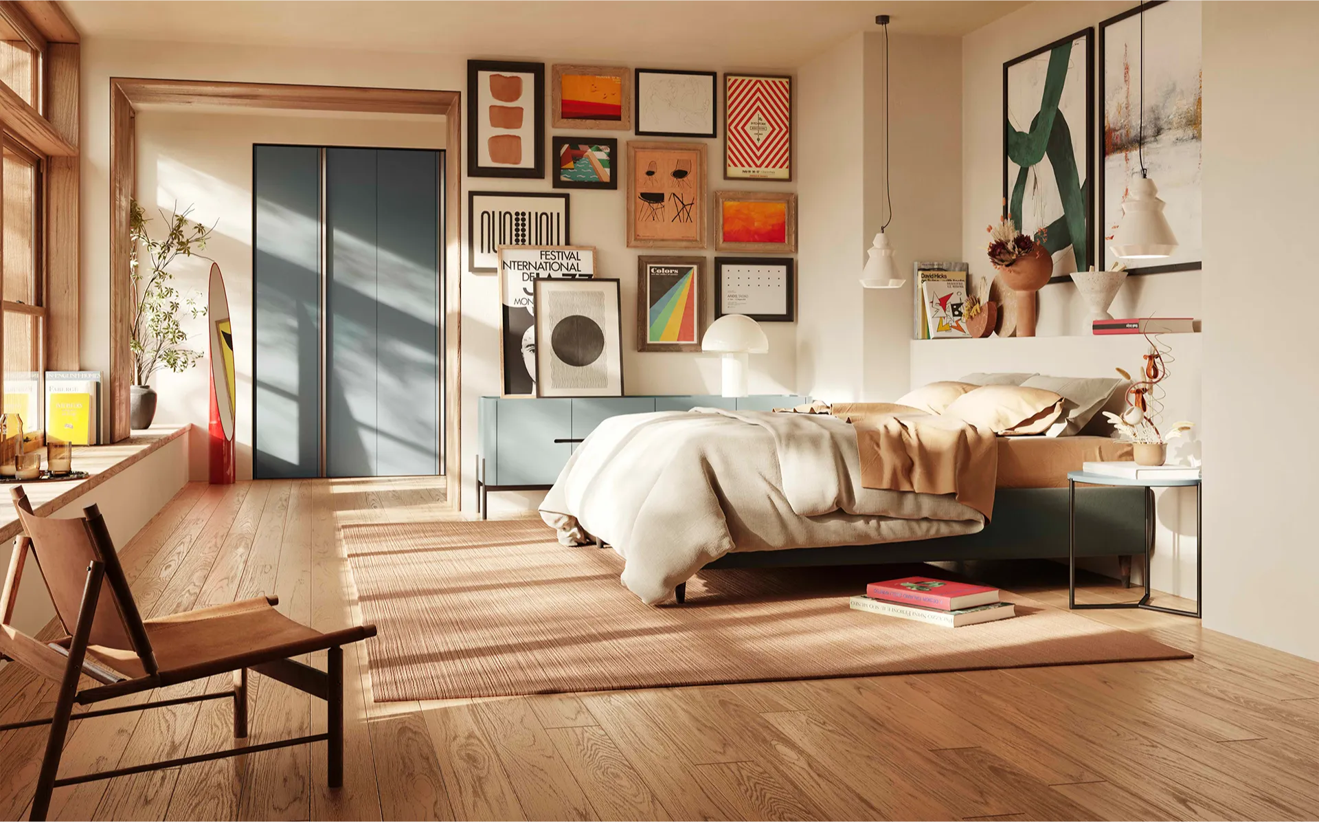
The Bedroom: Colours that Maximise Space
If colour defines the entire house, the bedroom is no exception. A blend of warm and cool tones amplifies its harmoniously structured layout. Distinctive elements like the vibrant alcove and contrasting walls, signatures of this colourful home, stand out yet again. Around the bed, shades of blue dominate, a colour synonymous with relaxation in the bedroom: from Petrolio to Blu cobalto on the double bed. The Nora bed epitomises versatility, with a two-tone design featuring Argento fabric cushions and a Blu cobalto headboard and frame, showcasing its chameleon-like adaptability in our collection.
With the flexibility to customise using a variety of materials and colours, either individually or in combination, this bed can be tailored to suit various settings and styles. Two key features remain consistent: a generously cushioned headboard for comfort, and extensive storage underneath the bed, offering unparalleled comfort and additional storage capacity.
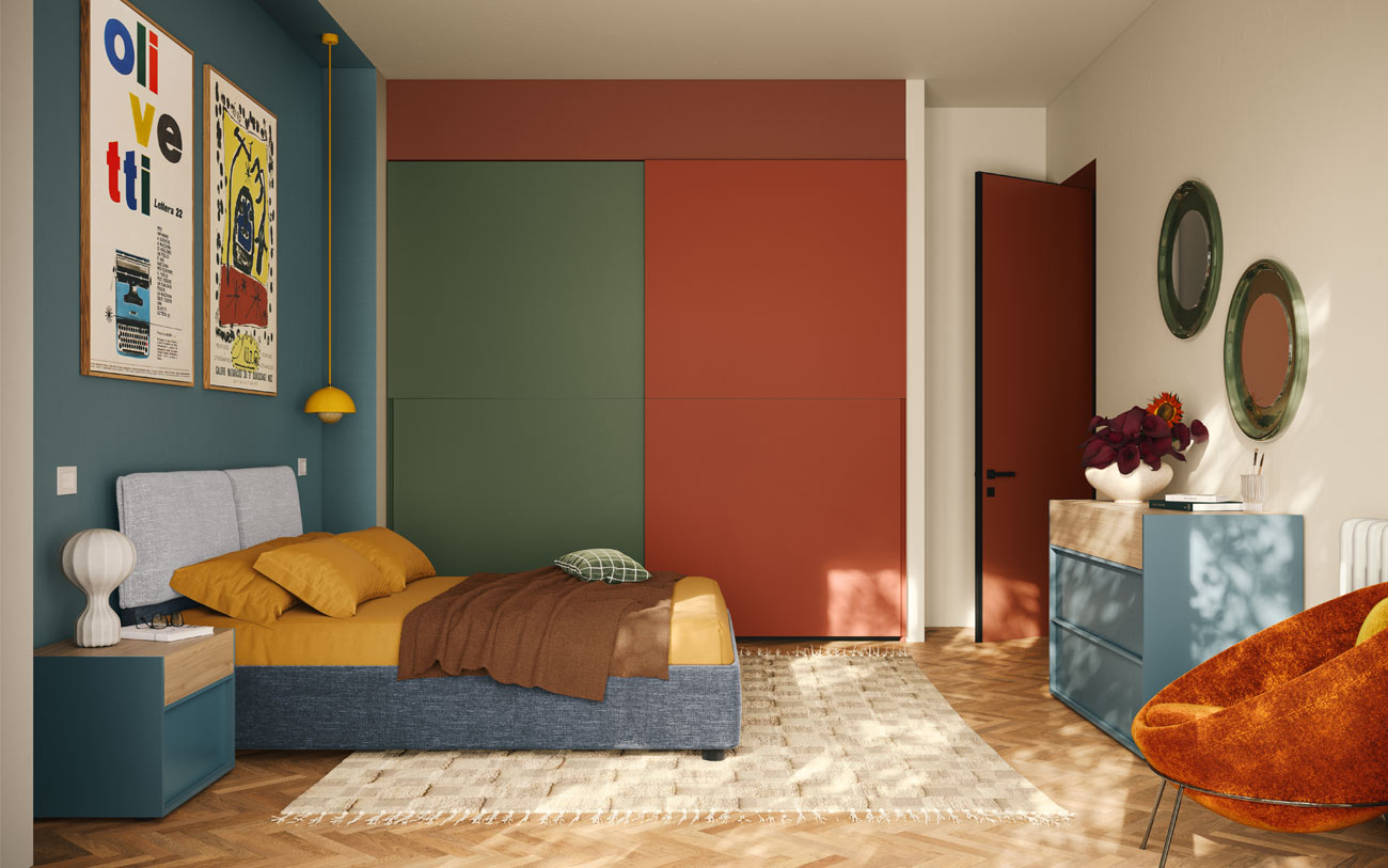
The wardrobe with sliding doors, recessed into an alcove, and the bedroom suite complete the furnishings. The wardrobe colours are warmer, with the two doors in contrasting hues: Oliva on one side and Mattone on the other. This creates a geometric design that visually divides the storage space for each partner. The bedside tables and chests of drawers from our Tour night collection, in Blu petrolio and Noce biondo, complement the other storage units in the room.
One Room, Two Potential Uses
Study or bedroom?
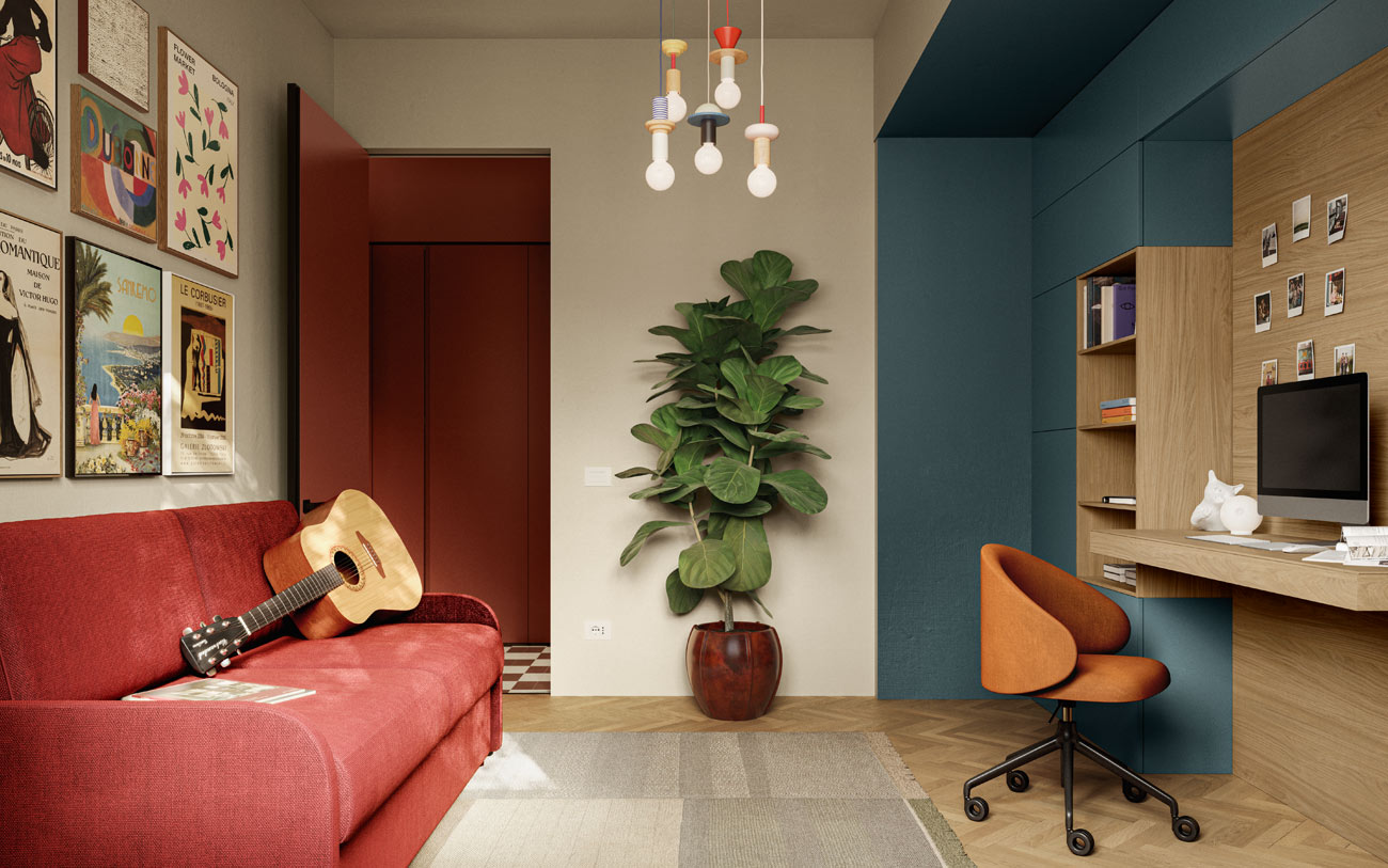
For the final room in the house, we envisioned two potential uses… actually three! A study area, guest room, or small bedroom.
In the first scenario, we created a versatile space perfect for hobbies like reading and music, as well as for work.
One wall is entirely taken up by a closed bookcase in Petrolio, divided centrally by Rovere nordico panelling that incorporates a 120 cm shelf, providing an excellent work surface for various activities.
Rovere nordico also frames the two open bookcase sections, designed for easy access with minimal effort. The hues and placement harmonise with the surrounding woodwork.
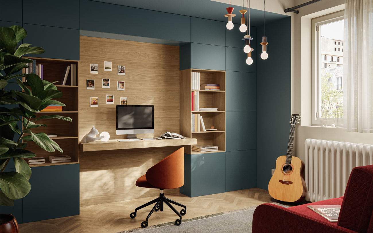
In total, this composition measures W 400 x D 50 x H 254 cm, but can easily be adapted to fit your space.
Completing the set-up and enhancing the room’s versatility is the sofa bed. With just a few simple adjustments, the home office transforms into a guest room.
Following the design logic that defines the entire project, where contrasting and complementary colours are chosen for their aesthetic impact and the emotions they evoke, the sofa bed was selected in a vibrant primary red. This bold choice stands out strikingly against the rest of the furnishings.
Dimensions: L 200 – D 96/210 – H 94 cm.
How the Space Transforms Depending on its Use
In this second version, the room’s architecture remains unchanged, but is transformed into a teenager’s bedroom. The play of two contrasting wall colours reappears, distinguishing distinct areas within the room. The two colours serve as expansive backdrops that set the entire scene. Verde salvia, chosen for the bed and wardrobe area, provides a calming and relaxing backdrop, while Bianco, used for the desk area, creates a brighter and more energising environment.
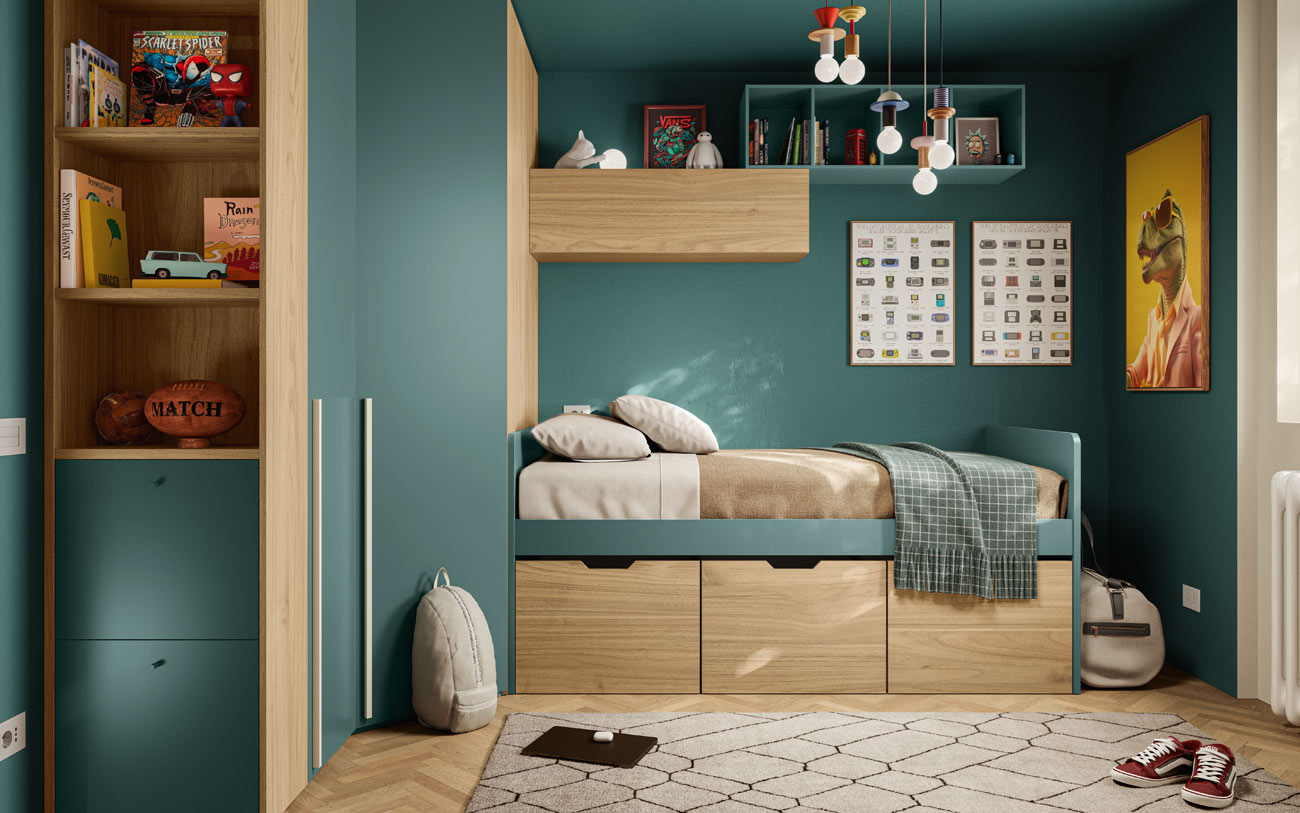
The storage solution is both optimal and innovative. Instead of a traditional wardrobe, we opted for a large wardrobe that utilises the entire corner, transforming it into a dressing space.
This area allows the teenager living here to store their favourite sweatshirts and t-shirts, gym bag, and trainer collection. In addition to the standard configuration, which includes hanging rods and a shelf for t-shirts, we’ve added a chest of drawers for bed linens.
At the end of the wardrobe, two space-saving features enhance functionality: upper shelves create a small bookcase, while two shoe compartments make use of otherwise overlooked space.
The bed also features additional storage, with three large drawers that complement the wardrobe.
This relaxation area is characterised by Verde salvia, which extends from the plasterwork to the fronts of the wardrobe and bed frame. The space is further enhanced by Noce biondo, a warm and inviting wood finish that we recommend for fans of this material and often use in sleeping areas. Discover more teenage bedroom projects and explore various finish combinations here.
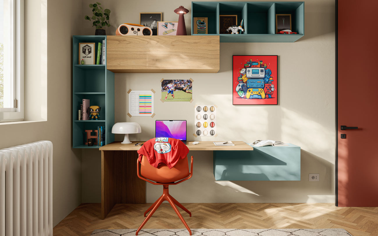
On the opposite wall, you’ll find the study area: a spacious desk accompanied by wall-mounted modules, both closed and open, adding a modern and functional touch to the workspace.
Colour Makes a Statement Even in the Utility Room
No room in the apartment was overlooked in the renovation project; even the utility room was reorganised and revitalised with a splash of colour. We used our open cupboard modules to create a practical piece of furniture, housing the washing machine and tumble dryer in the lower compartments. The shelves and enclosed spaces can be used to organise detergents and laundry that needs to be washed or ironed. Inside, the cabinet combines a Timo lacquer for the doors with a fabric-effect upholstery, adding character to the interior.


Drawing from natural inspiration, eclecticism, vibrancy, and efficient space organisation, along with furniture choices geared towards multi-functionality, this colourful home embodies a variety of styles and emotions.
Are you ready to express your personality and emotions through colour to transform your home? Come and visit us!